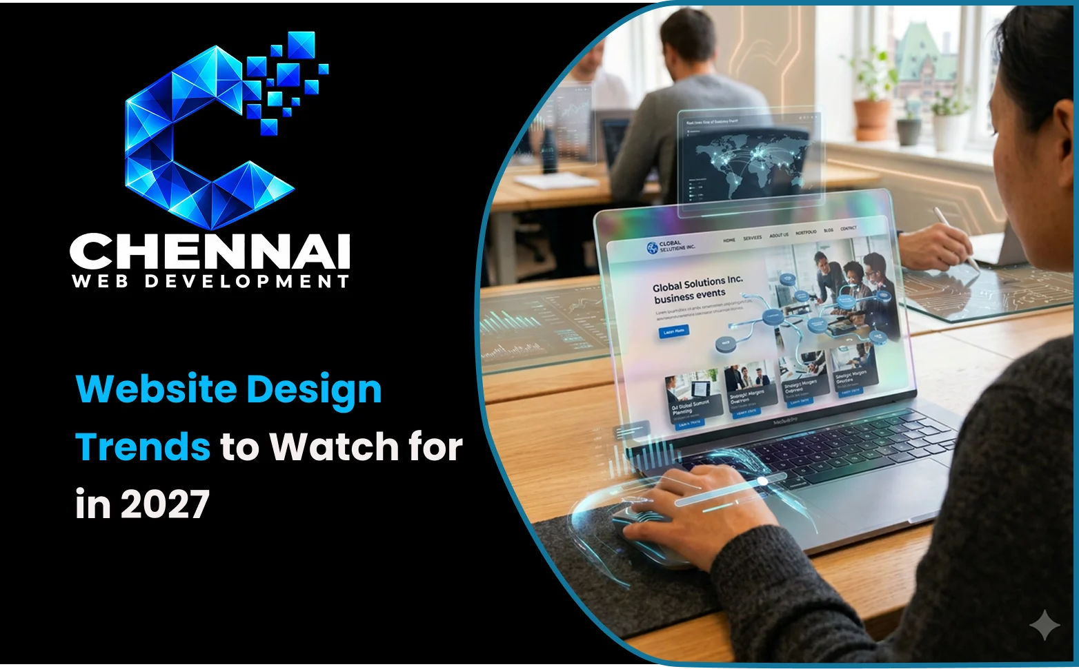
Quick Answer: What Are the Website Design Trends to Watch for in 2027?
Website design trends to watch for in 2027 include AI-assisted personalisation, expressive typography, reusable design systems, purposeful animation, accessibility-first interfaces, performance-focused visuals, authentic brand imagery, focused layouts, adaptive colour schemes, conversational interfaces, responsive experiences, and structured content.
These trends should not all be treated as confirmed predictions. Accessibility, responsive design, and performance are established website quality priorities. Wider adoption of AI-assisted experiences and more adaptive interfaces is a possibility that businesses should evaluate according to their audiences, budgets, and objectives.
Introduction
Website design involves more than selecting colours, fonts, and images. It also determines how visitors understand a business, find information, interact with services, and complete important tasks.
As businesses plan for 2027, designers will continue to balance visual identity with usability, accessibility, performance, and changing digital capabilities. Some approaches, such as reusable components and responsive layouts, build on established practices. Others, including more personalised AI-assisted experiences, offer possibilities that businesses may explore as the technology and its applications develop.
This article examines 12 website design trends worth considering in 2027. It distinguishes established design priorities from emerging approaches and explains how businesses can evaluate each trend before investing in it.
1. AI-Assisted Personalisation and Relevant Content
AI-assisted personalisation can help businesses present more relevant information based on a visitor's stated needs, selected preferences, or previous interactions where appropriate.
For example, a software company could guide visitors towards relevant product information after asking about their requirements. An online store might recommend related products, while a service business could provide a guided selection tool to help potential customers understand which service suits their needs.
These are possible applications rather than a guarantee that every business website will benefit from AI personalisation in 2027.
How businesses can apply this approach
-
Offer guided service selection when customers struggle to understand the available options.
-
Present relevant product recommendations when they help people compare products.
-
Use clearly explained preferences to personalise selected content.
-
Give visitors control over optional personalisation features.
-
Review how personal information is collected and used.
Personalisation should not make the website unpredictable. Visitors should still be able to use familiar menus, access essential information, and understand why a recommendation appears.
Businesses should also test personalised content for accuracy and usefulness. A well-organised service page or FAQ section may solve the problem more effectively than an expensive AI implementation.
2. Expressive Typography and Distinctive Headlines
Typography can communicate brand personality while helping visitors understand the main message of a page. Designers can use distinctive typefaces, clear visual hierarchy, controlled line breaks, and contrasting font weights to create a recognisable identity.
For example, a web development company might use a concise headline explaining its main service, followed by a supporting description and a clear enquiry option.
Practical implementation tips
-
Make the main heading understandable at a glance.
-
Use a consistent set of font families and weights.
-
Keep text readable across desktop and mobile screens.
-
Check line length, spacing, and contrast.
-
Optimise font files and loading behaviour.
Expressive typography is most effective when it improves communication. Oversized text that hides important information or creates awkward mobile layouts can reduce usability.
The aim is to combine distinctive visual presentation with readable, useful content.
3. Modular Layouts and Reusable Design Systems
Modular design uses reusable components to create consistent page layouts. These components might include service summaries, feature comparisons, testimonials, project examples, FAQs, and calls to action.
A business offering multiple services could use a shared page template for each service. The layout would remain familiar while the descriptions, examples, and supporting information would change according to the service.
How to use modular design
-
Identify the sections that appear repeatedly across the website.
-
Create reusable components for those sections.
-
Establish consistent rules for spacing, typography, buttons, and colours.
-
Define how each component behaves on smaller screens.
-
Review components regularly to ensure they remain accessible and easy to maintain.
Card-based and bento-style layouts are examples of how modular components can be arranged visually. They can present related information in an organised grid, but excessive cards and borders may make a page feel fragmented.
A reusable design system should improve consistency and maintenance without making every page look identical.
4. Purposeful Animation and Microinteractions
Animation can communicate an action, show a state change, or help explain how an interface works. Microinteractions are small responses to user actions, such as a button changing state, a menu opening, or a form displaying confirmation after submission.
More elaborate motion can also support product demonstrations and visual storytelling.
Animation best practices
-
Use motion to communicate a meaningful transition or action.
-
Keep essential content accessible without waiting for an animation.
-
Avoid unnecessary movement across every section.
-
Test interactions on mobile devices and lower-powered hardware.
-
Respect reduced-motion preferences where appropriate.
Animation should be evaluated by what it helps users accomplish, not by how visually impressive it appears.
If an effect delays content, makes controls harder to use, or causes distracting movement, simplify or remove it.
5. Accessibility-First Website Design
Accessibility is an established website quality requirement, not a trend that businesses should adopt only if it becomes fashionable.
The W3C Web Content Accessibility Guidelines (WCAG) provide recognised guidance for making web content more accessible. WCAG 2.2 became a W3C Recommendation on 5 October 2023, with an update published in December 2024.
An accessibility-first approach considers inclusive interaction during planning and design rather than treating it as a last-minute correction.
Practical accessibility checks
-
Use sufficient text and interface contrast.
-
Maintain a logical heading structure.
-
Provide visible keyboard focus indicators.
-
Give form fields meaningful labels and explain validation errors.
-
Ensure interactive controls can be operated using appropriate input methods.
-
Provide meaningful alternative text for informative images.
-
Respect reduced-motion preferences.
Accessibility should be tested alongside visual design and functionality. Automated tools can identify some issues, but keyboard testing and appropriate manual checks are also important.
Accessible design can improve usability for a broad range of visitors, including people using assistive technologies and people accessing websites in different environments.
6. Performance-First Visual Design
A visually rich website can still provide a fast experience, but large images, background videos, complex animations, and unnecessary scripts can increase loading time and affect responsiveness.
Performance-first design considers these costs before the visual implementation is finalised.
For example, a service page may communicate its message effectively with a relevant, optimised hero image and a clear headline rather than a large background video that delays the main content.
Practical performance improvements
-
Compress images and select suitable image formats.
-
Serve responsive image sizes for different screens.
-
Avoid loading large media assets before they are needed.
-
Reduce unnecessary JavaScript and third-party scripts.
-
Use suitable caching and hosting configurations.
-
Test important pages with PageSpeed Insights and review available Search Console data.
Google's Core Web Vitals guidance identifies three important measures of real-world user experience:
| Metric | What it measures | Good target |
|---|---|---|
| Largest Contentful Paint (LCP) | Loading performance | 2.5 seconds or less |
| Interaction to Next Paint (INP) | Responsiveness | 200 milliseconds or less |
| Cumulative Layout Shift (CLS) | Visual stability | 0.1 or less |
These targets are evaluated at the 75th percentile of page visits, with mobile and desktop data considered separately. See Google's Core Web Vitals threshold guidance.
A visually simple website is not automatically fast, and a visually rich website is not automatically slow. Performance depends on how the design is implemented and tested.
7. Authentic Imagery and Distinctive Brand Expression
A website's visual identity helps visitors recognise a business and understand what it offers. Genuine project photographs, product images, team photography, custom illustrations, and a consistent visual system can help a business communicate its identity.
For a web development company, genuine project screenshots and accurately described case studies may communicate its capabilities more clearly than generic stock images.
Ways to create a distinctive visual identity
-
Use images that relate directly to the content.
-
Maintain consistent image treatment and visual style.
-
Choose colours and typography that fit the brand.
-
Use genuine project examples when available and authorised for publication.
-
Review AI-generated imagery for inaccuracies and misleading representations.
Authenticity does not require every business to use photography. A distinctive illustration system or carefully designed typographic identity can also work well.
The priority is to ensure that the visuals support the business message rather than simply filling empty space.
8. Focused Interfaces and Useful Minimalism
Minimalist design is most effective when it removes unnecessary complexity while preserving the information visitors need.
A service page, for example, might clearly explain what the service includes, outline the process, answer common questions, and provide a relevant enquiry option. It does not necessarily need multiple competing banners or repeated calls to action.
How to apply focused design
-
Give each section a clear purpose.
-
Remove repeated messages and unnecessary decoration.
-
Use spacing to distinguish related content.
-
Keep essential navigation and service information visible.
-
Write concise copy that answers visitor questions.
Minimalism should not mean hiding menus, replacing meaningful labels with unexplained icons, or removing useful descriptions.
The goal is to make the website easier to understand without sacrificing important information.
9. Thoughtful Dark Mode and Adaptive Colour Systems
Dark mode can suit selected digital products, technology platforms, creative portfolios, and interfaces used in low-light environments. However, it is not automatically the best choice for every business website.
Some websites may work best with a well-designed light theme, while others may benefit from offering a choice.
What to consider
-
Maintain sufficient contrast in each theme.
-
Check body text, captions, form labels, and buttons.
-
Ensure links and interactive states remain identifiable.
-
Test brand colours and images against different backgrounds.
-
Make theme controls clear if visitors can switch between modes.
Simply inverting the colours of a light interface rarely produces a complete dark-mode design. Borders, shadows, images, and interactive states may need separate adjustments.
For most business websites, a well-designed primary theme is a reasonable starting point. Add a second theme when it supports user preferences or a defined product requirement.
10. Useful Conversational Interfaces
Conversational interfaces allow visitors to ask questions in natural language. A website assistant might help users compare services, locate information, understand a process, or identify the correct contact channel.
This approach may be useful for businesses with complex offerings or recurring customer questions. However, wider adoption in 2027 should be treated as a possibility, not a certainty.
How to implement conversational features responsibly
-
Define a specific problem the assistant should solve.
-
Use reliable information from approved business content.
-
Explain the assistant's limitations.
-
Provide a route to human support when needed.
-
Review answer accuracy and unresolved questions.
-
Consider privacy, data retention, accessibility, and maintenance costs.
A chatbot should not become the only way to access essential information. Visitors must still be able to browse service pages, read detailed content, and contact the business directly.
A clear FAQ page or contact form may be the more effective solution for a small business. Conversational functionality is worthwhile when it removes a genuine barrier for users.
11. Adaptive Layouts for Different Devices and Contexts
Responsive design remains an established foundation of modern websites. Adaptive experiences build on that foundation by adjusting selected elements according to screen dimensions, user preferences, or the task being performed.
For example, a product comparison tool may show several specifications side by side on a desktop screen but prioritise the most important details on a mobile device.
A booking interface might simplify its presentation on a smaller screen while retaining the same essential functionality.
Practical adaptive design principles
-
Use flexible layouts that respond to available screen space.
-
Prioritise essential content on smaller screens.
-
Preserve consistent navigation and terminology.
-
Respect relevant user preferences.
-
Test different content lengths and device conditions.
-
Check behaviour when users enlarge text or rotate their devices.
Adaptive design should not create an entirely different and unpredictable website for each visitor. The objective is to preserve clarity and functionality while making the interface suitable for the available space and task.
12. Structured Content for Search and Digital Discovery
Well-structured content helps visitors understand a website and helps search systems interpret its pages. This is an established content and technical quality practice, while the precise ways digital discovery tools may evolve in 2027 remain uncertain.
For example, a web development company can create a dedicated service page that explains the scope of the service, the development process, intended customers, and answers to common questions.
How to prepare website content
-
Give each important page a clear subject and purpose.
-
Use descriptive headings and meaningful internal links.
-
Present important information in readable sections.
-
Keep service descriptions and business details accurate.
-
Implement relevant structured data when the page qualifies.
-
Maintain crawlable navigation and appropriate technical SEO settings.
Structured data can help search engines interpret eligible content, but it does not guarantee enhanced search results or inclusion in AI-generated answers.
Businesses should prioritise accurate, useful information and sound technical implementation instead of relying on a particular design or markup technique to guarantee visibility.
Which Website Design Trends Should Businesses Prioritise in 2027?
The right approach depends on the website's purpose. An online store, a professional service provider, a creative portfolio, and a B2B software platform have different requirements.
| Design approach | Potentially suitable for | Main consideration |
|---|---|---|
| AI-assisted personalisation | Websites where tailored recommendations solve a real problem | Privacy, accuracy, and cost |
| Expressive typography | Brand-led and creative websites | Readability across devices |
| Modular design systems | Growing websites with repeated page patterns | Consistency and maintenance |
| Purposeful animation | Product demonstrations and interactive interfaces | Performance and motion accessibility |
| Accessibility-first design | All business websites | Inclusive functionality |
| Performance-first design | All websites | Loading speed and responsiveness |
| Authentic imagery | Service businesses and brands that rely on trust | Accuracy and consistency |
| Focused interfaces | Websites that need clear communication | Preserving useful information |
| Dark mode | Selected products and digital experiences | Contrast and theme maintenance |
| Conversational interfaces | Businesses with recurring customer questions | Reliable answers and human support |
| Adaptive layouts | Complex interfaces and multi-device experiences | Consistent behaviour |
| Structured content | Service websites and content-rich websites | Accuracy and technical implementation |
For most businesses, the most practical starting point is a clear layout, readable content, accessible interactions, reliable performance, and a distinctive brand identity. More specialised features can be evaluated after these foundations are in place.
Before-and-After Example: Improving a Business Service Page
The following is an illustrative example of how a traditional service page could be improved by combining established design principles with selected modern approaches. It is not a real client case study.
| Before | Improved approach |
|---|---|
| Generic headline that does not explain the service | Clear headline describing the service and its main benefit |
| Large, unoptimised background video | Relevant, optimised hero image |
| Several competing calls to action | One clear primary action, supported by relevant secondary links |
| Long, undifferentiated paragraphs | Scannable sections with descriptive headings |
| Decorative animations throughout the page | Motion used only when it explains an interaction or provides feedback |
| Repeated service information | Reusable content sections with clear, distinct purposes |
| Unclear mobile layout | Responsive layout tested across screen sizes |
| No performance or accessibility checks | Measured performance and tested keyboard usability |
The improved version does not require every emerging trend. It combines useful content, visual clarity, responsive behaviour, and measurable quality checks.
For a real redesign, compare the existing page with the revised version and test whether visitors can find information and complete important tasks more easily.
How Businesses in Chennai Can Apply These Trends
For businesses in Chennai, website design decisions should reflect target customers, services, and business objectives.
A professional service provider may benefit from clear service pages, genuine project examples, and straightforward enquiry options. An e-commerce business may prioritise product discovery, useful filters, responsive product images, and an accessible checkout. A technology company may find value in modular layouts and demonstrations that explain complex products.
Local relevance can also help visitors evaluate a business. Accurate service-area information, relevant local project examples, and clear contact details can make it easier for prospective customers to understand whether the business meets their needs.
Businesses considering website development services in Chennai should prioritise design and functionality that solve real user problems rather than adopting every emerging feature.
The appropriate trend is the one that improves the experience for the intended audience and can be maintained effectively.
Website Design Trends Implementation Checklist for 2027
Before implementing a design change, use the following checklist to evaluate its purpose and results.
Purpose and usability
-
Can the feature be linked to a defined user need or business goal?
-
Can visitors still find essential information without using optional AI or chatbot features?
-
Can users complete key tasks on both mobile and desktop devices?
-
Have representative users tested the revised interface?
Accessibility and functionality
-
Can the main interactions be operated using a keyboard?
-
Are focus indicators visible and text sufficiently readable?
-
Do forms display clear labels, errors, and confirmation messages?
-
Does motion respect reduced-motion preferences where appropriate?
Performance
-
Have page performance measurements been recorded before the change?
-
Have performance and responsiveness been tested again after implementation?
-
Have large media files and unnecessary scripts been reviewed?
-
Have available Core Web Vitals data and real-device behaviour been checked?
AI and content quality
-
Have AI-generated answers been checked against approved business information?
-
Are personalised experiences understandable and appropriately controlled?
-
Is personal information handled according to the business's privacy requirements?
-
Are service descriptions, headings, and structured data accurate?
Measuring results
-
Has the relevant baseline been recorded before launch?
-
Are important actions, such as enquiries or purchases, measured appropriately?
-
Have results been compared after the change using the same measurement method?
-
Have any usability, accessibility, or performance regressions been documented and addressed?
This checklist helps businesses distinguish useful improvements from features that look impressive but do not deliver meaningful benefits.
Conclusion
Website design in 2027 will continue to balance visual identity with practical requirements. AI-assisted experiences and conversational interfaces offer possibilities for selected use cases, while accessibility, responsive layouts, readable content, and reliable performance remain essential foundations.
Before redesigning a website, identify the three most important problems visitors face. Test the current experience, prioritise improvements, and measure the results after implementation.
A successful website does not need every new feature. It needs a clear purpose, useful information, and a design that helps people understand and interact with the business.